


Adaptive Cards are a standardized “recipe” for writing a Card. While Viva Connections has a built-in Adaptive Card “app”, in SharePoint you need to first download a web part from the SharePoint store.
In this tutorial, we’ll go through the installation process and cover how you can make your own Adaptive Cards.
Get the web part

There is a handy-dandy web part called App integrations that lets you embed Adaptive Cards on any SharePoint page. So to start, go to Microsoft App Source and get yourself the web part.
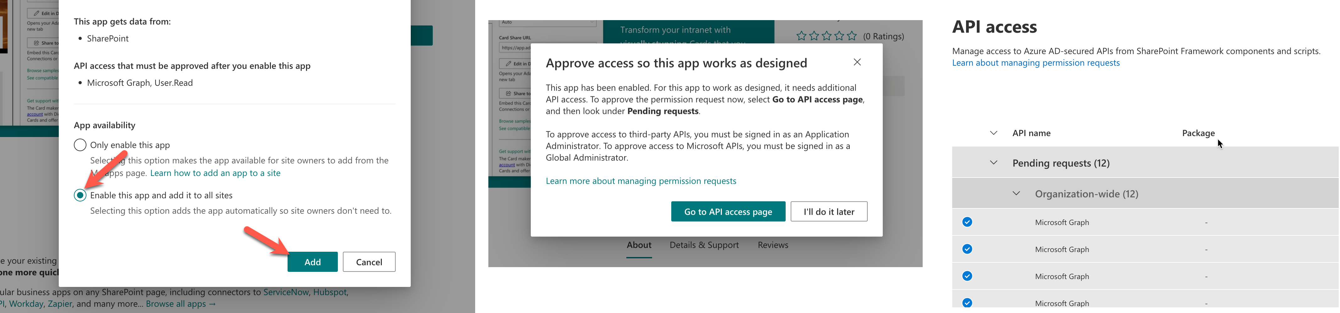
Once you click on Get it now you need to follow a couple of prompts to enable the web part to become available to your SharePoint admins. Now, you can add the web part to your page from the “picker” dropdown. Once it’s on your page click the Edit button to open the configuration sidebar.

The whole web part is designed to either let you directly Connect to an app or Embed an existing Card. We’ll focus on the embedding option which basically lets you embed a Card you made elsewhere, just like you can embed a YouTube video.
Find a suitable template
Now, for our Adaptive Card web part we need to find a template to base our design off of. In our list you’ll get to a collection of templates that are divided into ones for employee experience, basic building blocks, such as lists or notifications, and, ones specifically designed for SharePoint/Viva.

Just pick one you like and then press the Deploy to Viva or SharePoint button. This will launch you into the Adaptive Card designer where your template will load.
Change the Adaptive Card’s design

The Adaptive Card designer is broadly sectioned into 3 areas of interest:
- The yellow area is the main canvas for your Card. You can drag elements from the left into the Card, e.g. to add an image or another text block. Elements within the card can be rearranged via drag-and-drop. In dark yellow, you see what element is currently active as highlighted in the Card Structure section. To the right, you see additional options for the currently active element, i.e. change the image size, font weight, etc.
- In the purple area, your entire Card is represented as JSON. JSON is a file format similar to HTML, and this lets you copy-and-paste your entire Card design. When you make changes in the yellow area, this area will be updated each time.
- In turquoise, you see your data. If you’ve used Microsoft’s version of the Adaptive Card Designer you will know this section to be static JSON, presumably taken from some API’s docs, and you can insert this data into the Adaptive Card using “Templating“. However, in our version you can automatically retrieve live data from your apps for this section. To connect this box to an app, click the Connect to data source button along menu bar on the top (which we’ll do in step 4).
Just make your changes as you desire, try different templates or refer to the Adaptive Cards Schema explorer as required.
Get live data from an app (optional)
In the penultimate step, we’ll now connect the Adaptive Card to one of the apps that are available from the App Directory. Click on the Connect to data source button. Then search for and select your app from the dropdown. You can see all available app in the App Directory.
The subsequent steps can differ from app to app, some are a straightforward OAuth authorization, other apps require you entering an API key or other parameters.

Once your data is connected it will appear in the bottom right-hand corner of your Adaptive Card Designer where you can then integrate it into your Adaptive Card design where you can insert it into your Card using Templating.
Finally, we come full circle and our Card is ready to be embedded into our SharePoint page. Deploying the Adaptive Card is super simple, just click on the Share button along the top of the Designer and then Copy the Card Share URL over to your web part and adjust the Card’s height to your liking. And there it is!
~~~
Did you find this tutorial useful? Were you able to make your own Adaptive Cards for SharePoint? Let me know in the comments below.


